Are you often puzzled about how to ensure your training is effective while cleverly avoiding those pesky injuries? Or are you looking for a scientific method to monitor and adjust your training plan? If so, today we will delve deep into a popular metric in sports science – the ACWR (Acute:Chronic Workload Ratio).
What Exactly is ACWR?
Simply put, ACWR is an indicator that measures how well our bodies adapt to changes in training load. It assesses whether your current training status is safe and effective by comparing “how much you’ve trained recently” (acute load) with “how much you’ve been accustomed to training over a past period” (chronic load).
- Acute Workload (AW): Typically refers to the total training volume you’ve undertaken in the past week (7 days). It represents the immediate stress and fatigue your body is currently experiencing. Think of it as your “effortful sprint” for the week.
- Chronic Workload (CW): Usually refers to your average weekly training load over the past four weeks (28 days). It represents the load level your body has adapted to and can stably handle, like your “fitness base” or “training foundation.”
The calculation formula for ACWR is also quite intuitive:
\[ACWR = \frac{\text{Acute Workload (AW)}}{\text{Chronic Workload (CW)}}\]So, what does this ratio tell us? Extensive research by sports scientists has found a very interesting “U-shaped” or “J-shaped” relationship between ACWR and sports injury risk (we’ll discuss this curve later, see Figure 12):
- ACWR < 0.8 (Undertraining Zone / “Too Easy” Zone): The load is too low! Not only might training effects be compromised, but long-term low load can also make the body “lazy,” increasing injury risk when intensity is suddenly increased.
- ACWR 0.8 - 1.3 (Optimal Zone / “Sweet Spot”): This is the ideal state we aim for! Within this range, training load increases steadily, the body adapts well, fitness improves, and injury risk is relatively low.
- ACWR 1.3 - 1.5 (Warning Zone / “A Bit Much” Zone): The load is increasing a bit too quickly! The body may start to feel strained, injury risk rises, and close monitoring of the body’s response is needed.
- ACWR > 1.5 (Danger Zone / “Playing with Fire” Zone): Warning! Warning! The acute load far exceeds the chronic load, meaning you’re stressing your body too much, too fast. The body likely won’t adapt in time, and injury risk significantly increases!
The core wisdom of ACWR is: a solid and stable chronic workload foundation is a prerequisite for safely tolerating higher acute workloads. If you want to “sprint hard,” first ensure your “fitness base” is solid enough.
How to “Quantify” Our Training? — Let’s Talk About Training Load
To calculate ACWR, we first need to know how to measure “training load.” This might sound complex, but there are some very practical and down-to-earth methods.
The most commonly used and easiest to implement method is measuring internal load, particularly sRPE (Session Rating of Perceived Exertion).
- sRPE = RPE (Rating of Perceived Exertion, typically 1-10 scale) × Training Duration (minutes)
RPE is how tired you feel after a training session, where 1 means “no effort at all” and 10 means “exhausted, unable to continue.” Give yourself a score after training, multiply it by the session duration in minutes, and you get the sRPE load value for that session.
Of course, there are also methods for measuring external load, such as total distance run, high-intensity running distance recorded by GPS watches, or total weight lifted in strength training.
In this article’s demonstration, we will primarily use sRPE to quantify daily training load.
Preparation and Data Simulation
Before diving into the analysis, we need some data. We will simulate daily RPE and training duration data for a period, and calculate daily training load (sRPE), cumulative load, and subsequently the acute workload (AW), chronic workload (CW), and ACWR values needed for analysis.
Let’s see what daily training load might look like. Figure 1 illustrates this.
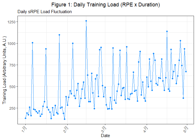
The graph above (Figure 1) shows the fluctuation of daily training load over a period. As you can see, some days have high loads, and some have low loads, which is normal and reflects the rhythm of a training plan. Understanding this basic daily load data is the starting point for all subsequent analyses.
We can further examine the two factors constituting sRPE—the distribution of RPE and training duration.
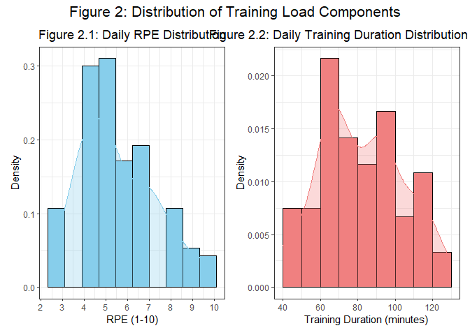 Through Figure 2.1 (Daily RPE Distribution) and Figure 2.2 (Daily Training Duration Distribution), we can understand whether training is primarily high-intensity (high RPE), long-duration, or both. This helps us fine-tune training strategies. For example, if RPE is generally not high but duration is long, one might consider appropriately increasing training intensity and shortening duration to improve training efficiency.
From Daily Load to ACWR
With daily training load data, we can start calculating the key components of ACWR—Acute Workload (AW) and Chronic Workload (CW).
- Acute Workload (AW): As mentioned, usually the sum of training load over the past 7 days.
- Chronic Workload (CW): Usually the training load over the past 28 days (4 weeks), calculated as the average weekly load over these 28 days (i.e., total 28-day load divided by 4).
To better understand how AW and CW evolve from daily load, let’s look at Figure 4 below. It overlays the 7-day rolling average (orange line, reflecting short-term trends) and the 28-day rolling average (blue line, reflecting long-term adaptation base) on top of the daily load (gray dashed line).
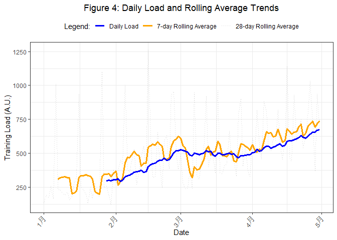
In Figure 4, the gray dashed line is the original daily load, which fluctuates considerably. The orange solid line is the 7-day rolling average load, which smooths out daily fluctuations and reflects short-term load trends (can be seen as the average daily acute load level). The blue solid line is the 28-day rolling average load, which is even smoother and represents the long-term load adaptation base (average daily chronic load level).
When the orange line (short-term trend) is significantly higher than the blue line (long-term base), it usually indicates that the ACWR value may increase.
Next, we will convert these daily averages into AW (7-day sum) and CW (4-week average weekly load) and observe their trends, as shown in Figure 5.
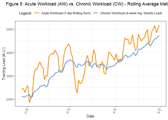
In Figure 5, the orange line represents Acute Workload (AW), and the blue line represents Chronic Workload (CW). It’s clear that AW typically fluctuates more dramatically than CW. When the AW line is significantly above the CW line, for example, in mid-to-late March 2023 in the simulated data, it means recent training stress far exceeds the body’s long-term adaptation level, causing ACWR to soar. Conversely, if the AW line is below the CW line, ACWR will be lower.
The relative positions and gap between these two lines directly determine the ACWR value.
Interpreting the ACWR Curve
Finally, we can plot and interpret the ACWR change curve itself! Figure 6 will show us the ACWR (rolling average method) trend and risk zones.
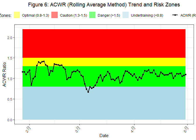
Figure 6 is the core chart for ACWR application. The black curve represents the daily calculated ACWR value, and the different colored background areas indicate the risk levels we discussed earlier:
- Green Zone (0.8-1.3): Optimal “sweet spot,” balancing fitness improvement and risk control.
- Yellow Zone (1.3-1.5): Warning zone, load increasing a bit too fast, requires attention.
- Red Zone (>1.5): Danger zone, load surge, high risk of injury!
- Light Blue Zone (<0.8): Undertraining zone, may affect training effectiveness or increase risk during subsequent load increases due to decreased training level.
By observing how this ACWR curve moves through different zones, we can intuitively assess the risk of the training plan. For example, in the simulated data, the ACWR curve once surged into the red danger zone in mid-to-late March 2023, clearly indicating a potentially significant problem with load management during that period. Although it subsequently dropped, it still hovered in the yellow warning zone. Later, the ACWR value might drop into the light blue undertraining zone.
Besides observing ACWR changes over time, we can also statistically look at the main distribution ranges of ACWR values over the entire observation period (Figure 7).
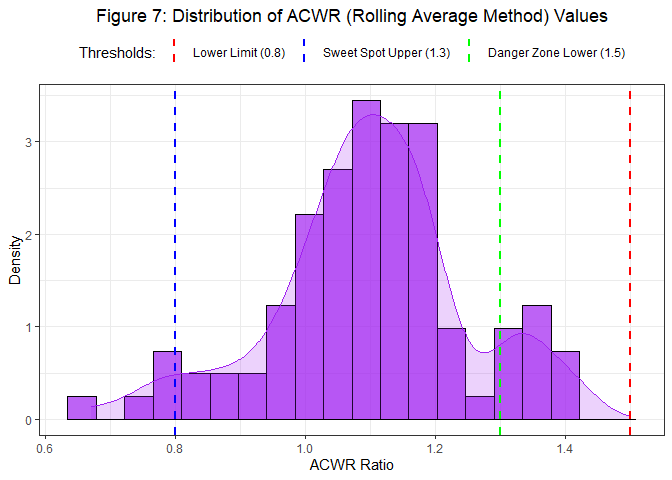
The histogram and density curve in Figure 7 help us grasp the overall risk profile of the training plan—is it mostly stable in the “sweet spot,” or often “flirting with danger”? This is very valuable for adjusting long-term training strategies.
Not Just a Ratio — Pay Attention to Load “Spikes”
ACWR focuses on the relative relationship between short-term and long-term load. However, sometimes even if the ACWR value is acceptable, a sharp increase in single-day load (we call this a “load spike”) can itself be an independent injury risk factor. Imagine you usually run 5 km, and suddenly one day you’re asked to run 20 km. Even if your average running volume over the past few weeks (chronic load) is decent, this sudden “spike” might be too much to handle.
Therefore, monitoring the rate of change in daily load is also necessary. Figure 8 will show these “spike moments.”
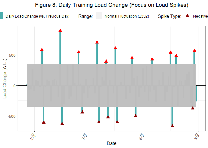
Figure 8 shows the daily load change compared to the previous day. Those significant positive spikes (red triangles) and negative spikes (dark red inverted triangles) deserve our attention. Positive spikes can bring excessive impact, and if a negative spike (sharp decrease) is followed by a large positive spike, caution is also warranted.
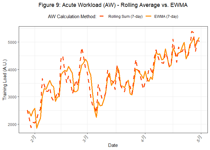
Striving for Excellence — Rolling Average vs. Exponentially Weighted Moving Average (EWMA)
When calculating AW and CW, besides the commonly used rolling average (or rolling sum) method, there’s another method called Exponentially Weighted Moving Average (EWMA). EWMA gives more weight to recent data, theoretically making it more sensitive to load changes.
Let’s compare AW, CW, and the final ACWR calculated using these two methods. First, the AW comparison (Figure 9).
Next is the CW comparison (Figure 10).
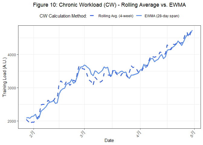
From Figures 9 and 10, it can be seen that the AW and CW curves calculated by the EWMA method (dashed lines) usually react earlier or more smoothly to trend changes than the rolling average method (solid lines), because EWMA continuously considers historical data but gives greater weight to recent data.
Finally, here’s a comparison of ACWR calculated by the two methods, as shown in Figure 11.
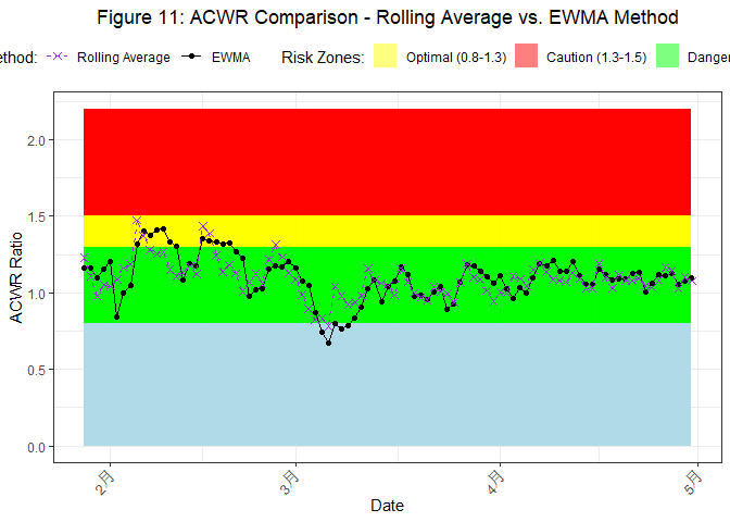
Reflected in the final ACWR (Figure 11), EWMA-based ACWR (purple dashed line) often shows greater volatility or reacts faster to load changes than rolling average-based ACWR (black solid line). For example, during periods of rapid load increase, EWMA-based ACWR might enter high-risk zones earlier and more significantly.
Which method is better? There’s no absolute answer. EWMA might provide a more “sensitive” risk signal, but it could also generate more “noise” due to its higher sensitivity to single-day extreme values. Choosing which method to use, or whether to use both, depends on your specific needs and preferences.
The U-Shaped Relationship Between ACWR and Injury Risk
Now, let’s revisit the theoretical relationship diagram between ACWR and injury risk mentioned earlier (Figure 12).
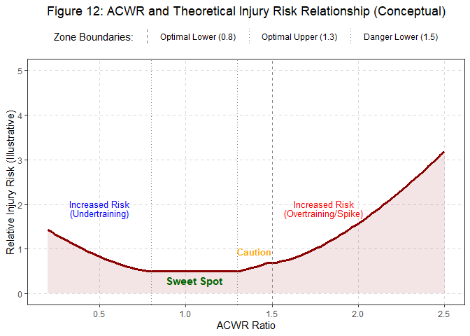
This diagram (Figure 12) classically illustrates why we strive to keep ACWR in the 0.8-1.3 “sweet spot.”
- ACWR too low (<0.8, left side of the curve rising): Undertraining, decreased physical function, “detraining effect” may lead to easier injury when load is subsequently increased.
- ACWR in the “sweet spot” (0.8-1.3, bottom of the curve): Lowest injury risk, the golden zone for fitness improvement and performance enhancement.
- ACWR too high (>1.3, right side of the curve rising sharply): Load increasing too quickly, far exceeding the body’s adaptive capacity, significantly increasing injury risk. Especially when ACWR > 1.5, risk escalates dramatically.
This chart clearly tells us: Training too little and training too much are both detrimental; balance is key.
ACWR is Good, But
ACWR is undoubtedly a powerful training monitoring tool, but when applying it, we need to remain clear-headed and pay attention to the following points:
- Individual Differences are Paramount: There’s no one-size-fits-all perfect ACWR threshold. Age, training history, injury history, sleep quality, nutritional status, psychological stress, etc., all affect an individual’s response to load.
- Data Quality is Fundamental: Accurate and consistent data recording is a prerequisite for the effectiveness of ACWR analysis. Especially RPE assessment, which requires athletes to be trained and provide honest feedback.
- Don’t Forget Absolute Load: Even if ACWR is in the “sweet spot,” if the absolute values of AW and CW themselves are very high, exceeding the athlete’s tolerance, high risk may still exist.
- Multi-dimensional Monitoring is Comprehensive: ACWR is just one of many monitoring indicators. It should be combined with athlete’s subjective feelings, sleep data, heart rate variability (HRV), sports performance test results, etc., for a comprehensive assessment.
- EWMA or Rolling Average? View Them Critically: Choose the appropriate calculation method based on specific situations and data characteristics, or consider both.
- ACWR is Not a Crystal Ball; Coach’s Experience is Irreplaceable: ACWR provides data-based trends and probabilities; it cannot replace a coach’s professional judgment and deep understanding of the athlete.Data is a tool to aid decision-making, not the decision itself.